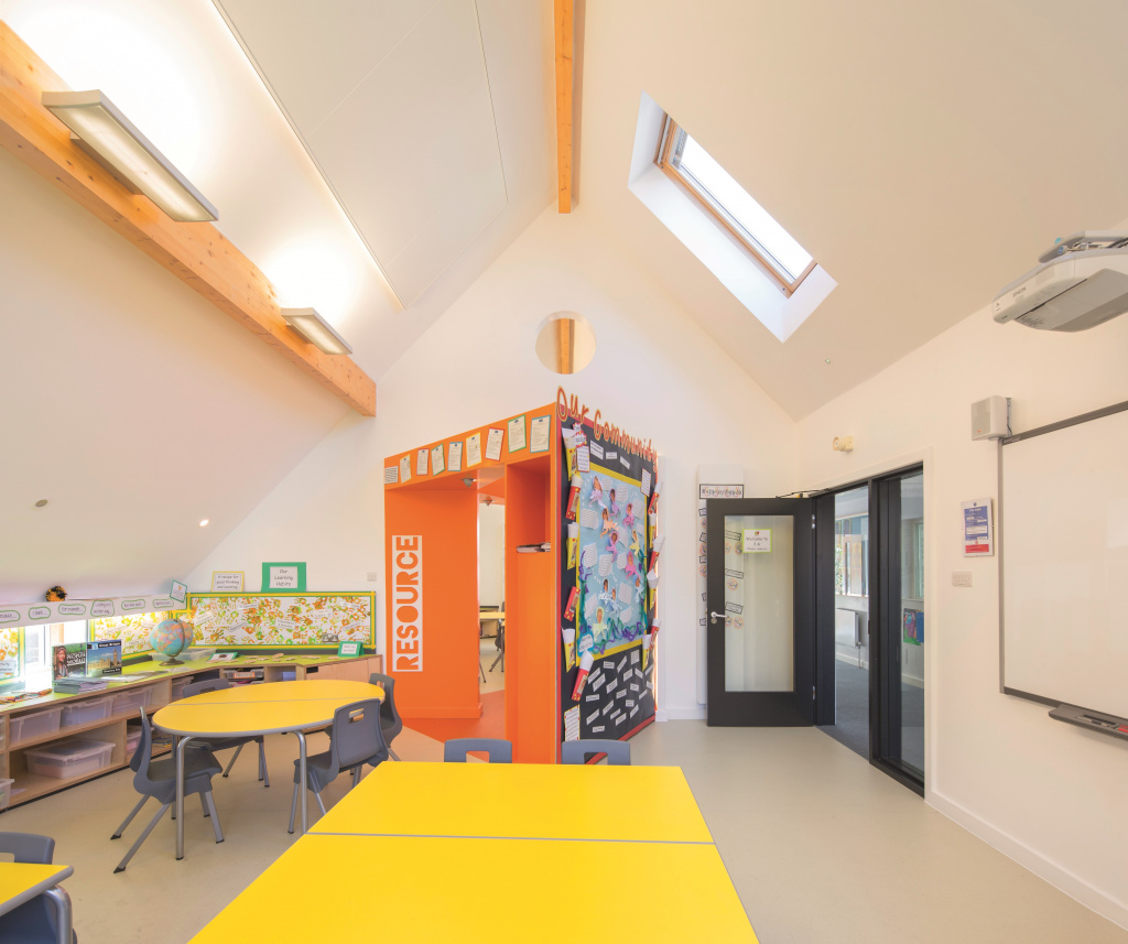
The Stephen Perse Foundation Junior School in the centre of Cambridge, UK is an urban school with a strongly creative approach to learning. Built right in the centre of the historic city every millimetre of space has value and none can be wasted.
Given a new focus on the pre-prep elements of the school, the school also needed to revisit the smaller teaching spaces and make the most of the available rooms. One of those spaces was an interconnecting classroom for year three pupils, aged 7 to 8.

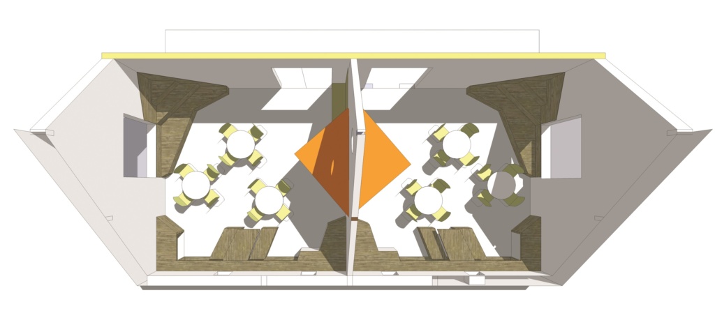
Following a briefing meeting between CDC architects, the school’s senior management group, teachers and other stakeholders, the firm produced an iterative series of design visuals. The joint objective was to create a completely fresh and flexible learning space with fixed furniture around the perimeter and a shared resource zone between the rooms. What Chadwick Dryer Clarke dubbed an “articulated classroom” where different groups or individuals could engage in different activities simultaneously without disturbing each other, was evolved through a programme lasting 20 weeks from concept to opening.
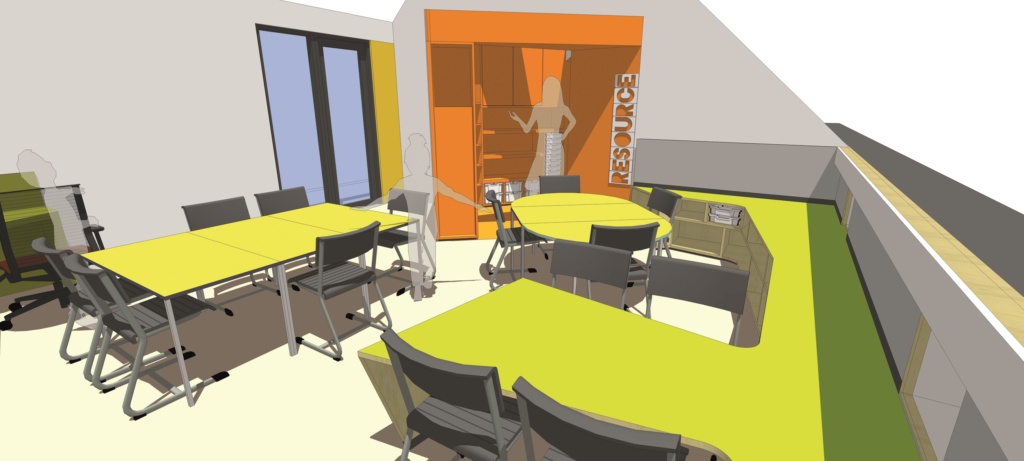
The learning rooms in question were adjoining conventional classrooms for year three pupils aged 7 – 8, with a maximum occupancy of 20 in each space. A key requirement, established at the appraisal stage, following initial brief and concepts, was for the shared space option. The original designs were amended accordingly, then extended to 3-dimensional iterations, enabling a fuller understanding of the proposals from all parties.

It was at this stage that the unique and challenging requirements for storage and systems that would facilitate the idea of flexibility whilst maintaining space ownership, order and security became more apparent. With a central resource area accessible from both classrooms, allowing for interactive engagement between the two there was still the need for a degree of acoustic separation and integration of technology. Among the specifics were; Gratnells tray storage units, individual personal space either under desk or as part of the furniture; lockable units for high value items such as iPads, low-level display areas for pupils’ work to be shown and teaching walls.
At the visualisation stage, ideas were turned into 3-dimensional computer models before the production process began. Both the central dividing structures and the perimeter units were created with integrated Gratnells trays and runners. Translucent trays were selected in order to offer a neutral counterpoint to the vibrant theme colours which were predominantly lime green and orange.
