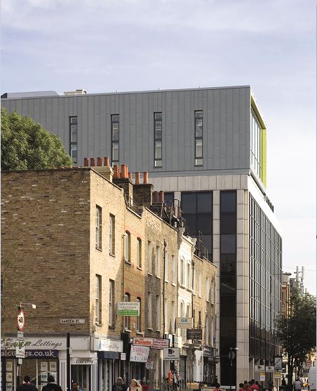
Twelve months later, they moved into a permanent home – a six (now seven) -storey former office building on Commercial Road, London E1. And the design of the premises reflected the educational philosophies that were determined during years of research by the Trust that had been established to apply for and ultimately run the school, meaning that on the day it opened, the school (which was designed for 420 students) had just eight enclosed general classrooms (none of which had doors), one projector, two clocks and no pinboards. Whilst the specialist spaces – laboratories and workshops – were excellent if more traditional, the school also recognised the role computing would have to 21st century citizens, so excellent wifi coverage was ensured across all parts of the premises.
And three years after that, we visited to see how they were getting on. “It’s not been an easy journey,” acknowledged Kerstyn Comley, the chair of Governors and one of the founding trustees. “At a school where we wanted the social capital to be as important as the academic capital, when you’re changing how teaching and learning is delivered, it’s hard work”. And it’s a sentiment that was shared by headteacher Karin Rowsell. But whereas it would have been easy to throw in the towel and revert to known practices, giving up clearly isn’t in either Kerstyn’s or Karin’s nature.

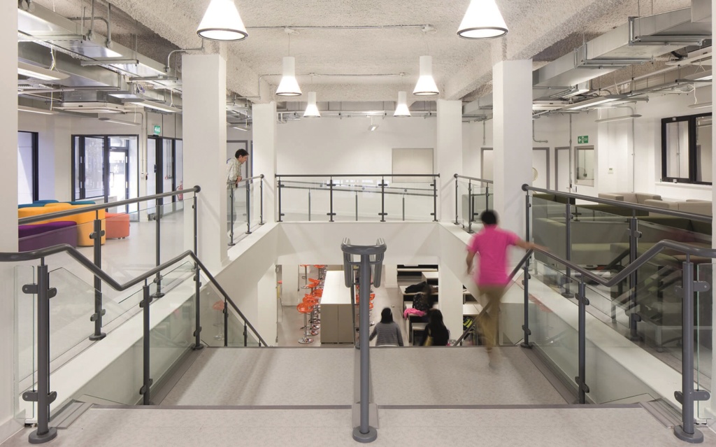
As a converted office building, the school is not surrounded by grounds in the way most schools are – in fact, the only outside space on the school premises is on the roof (they use nearby playing fields, parks etc for outdoor sports). So you walk in straight off the pavement into a large ground floor space casually furnished with sofas, café tables and chairs. The central part of the floor slab has been removed (see image on previous page) to create a generous stairwell down to the basement restaurant where the music department is too – away from the rest of the learning spaces, and providing acoustic separation from the inevitable noise of students practicing instruments.
If there’s one thing Karin has learnt, it is that when you create autonomous spaces (such as architectural practice ECE created upstairs on the four main teaching floors at Wapping) you need a sense of ownership. With a UK ‘Free School’ (a brand new school starting from scratch) it’s almost impossible for students to be involved (when the school was built, there were no students!), removing the opportunity for learner-led design which played such a big part in the projects we covered in the last issue. So pragmatism has to take over, and initially it’s the teachers who have to take the responsibility for controlling the space, but involving the students so ultimately they will self-police it. And where there is this sense of ownership, the spaces work well.

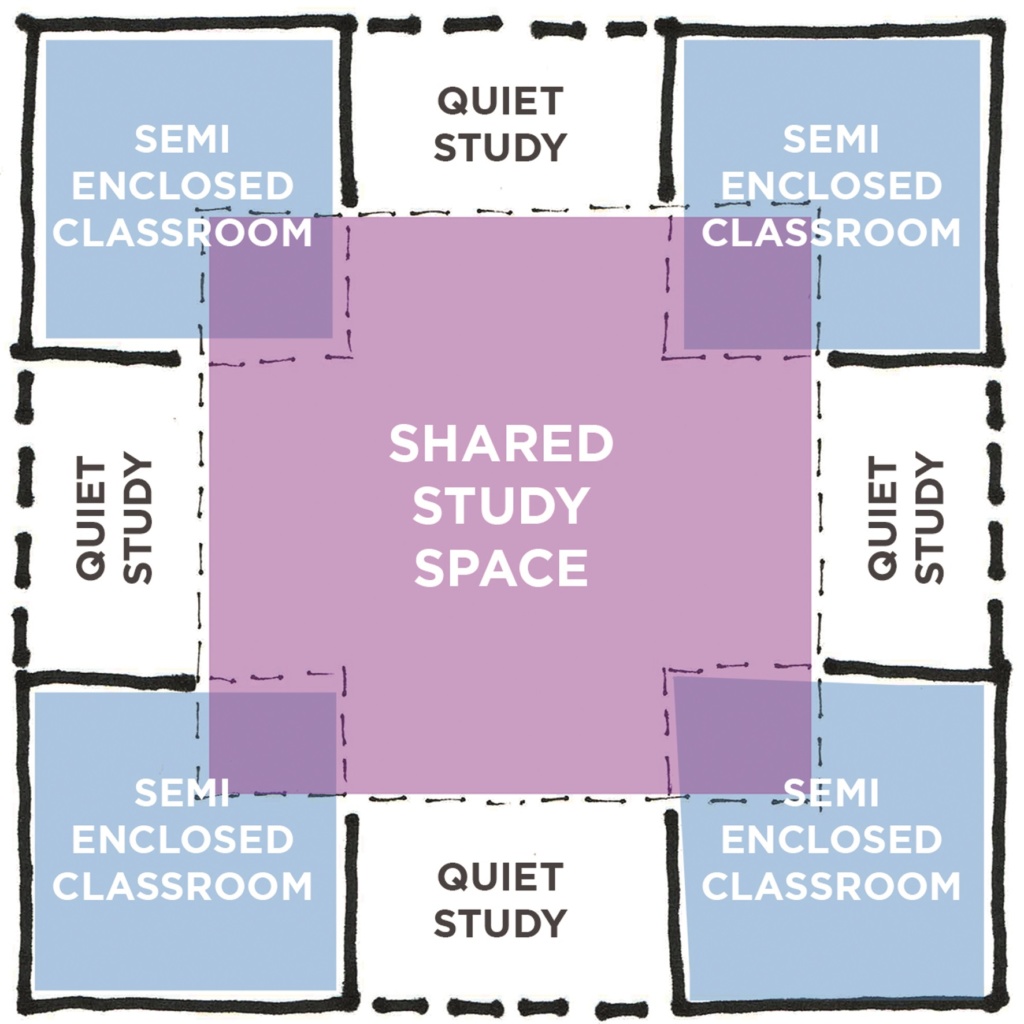
Nick Evans of ECE used a clever architectural device in the design of the main teaching floorplates. Removing the corners of the classrooms creates a quasi Venn Diagram of interconnected spaces (see right). As a future-proofing ‘insurance’ measure, just in case the school subsequently decided to revert to a more traditional model and infill them, the gaps left are precisely those of a door and glazed vision panel. The result is a combination of semi-enclosed and shared learning spaces. The rectangular semi-enclosed spaces had power and data provision in three positions – centrally on a short wall, centrally on a long wall, and in one of the corners, meaning teachers could alter the focus of the learning spaces by altering the position of the display screen and adjacent whiteboard (both of which were freestanding and mobile). Traditional didactic instruction would typically have the screen on the short wall and tables in rows, open, interactive, ‘debate-style’ might be achieved with the screen on the long wall with tables in a wide horseshoe, or more intimate discussion spaces might be arranged around a screen in a corner. There is no traditional teacher’s desk – but all staff have a mobile lectern-cum-caddy, which initially was intended to “follow” them around the school as, when the school was full, none of these spaces would be “owned” by a particular member of staff. It was for this reason too that display was planned as being digital (hence no pinboards) – the original lack of clocks was simply an acknowledgement that the screens (display or personal) would typically have clocks too, so why duplicate? Simple square, individual tables and reverse cantilever chairs from Origin gave the spaces a sense of agility, enabling the furniture to be quickly and easily moved around.

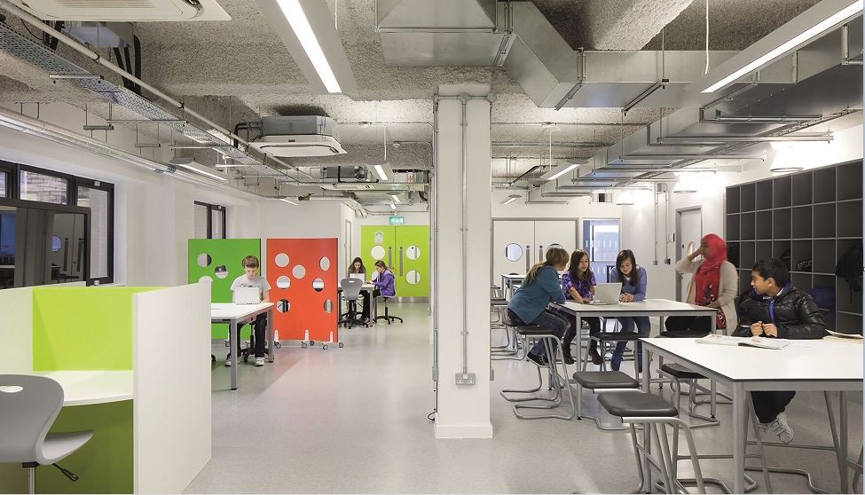
Within the shared spaces, a variety of different settings were provided predominantly from Spaceoasis, from individual study carrels to tiered seating arranged in a horseshoe (enabling a whole year group of 84 to be accommodated without using the hall). On the Science floor and the Arts & Design floor, these shared spaces took up a different character to reflect the type of study likely to go on there. Standing height project tables and banks of iMacs fill the Arts & Design floor, and mobile screens and agile tables on the Science floor where a strong STEAM approach is evident.