It’s a long time since I went to school and sat in a classroom that was characterised by rows of desks, rolling blackboards and some dingy notice boards around the walls that were gradually populated by examples of work we produced throughout the term. It was the 1970’s in fact. Given the advances we’ve made in understanding how the human brain responds to its environment and uses cues from all the senses to cement learning in long-term memory it’s surprising to me as a neuroscientist that many classrooms still haven’t progressed beyond this set-up. After all, if we look at the commercial world, and retail in particular, the application of psychology, technology and neuroscience is everywhere, creating worlds that people don’t just want to enter, but want to linger in, explore and interact with.
As a researcher and consultant on the neuroscience of retail design it occurred to me that by thinking of students as consumers of education, the classroom environment could also be evaluated, and ultimately optimised, in terms of its ability to focus attention and encourage student interaction and engagement using some of the principles that work so effectively in the shopping mall. As part of a recent project to attempt just that, which I completed with Spaceoasis and which was shown at BETT this year, I stumbled across a remarkable example of what good design can achieve in a learning space in Sweden: welcome to Brinkskolan.

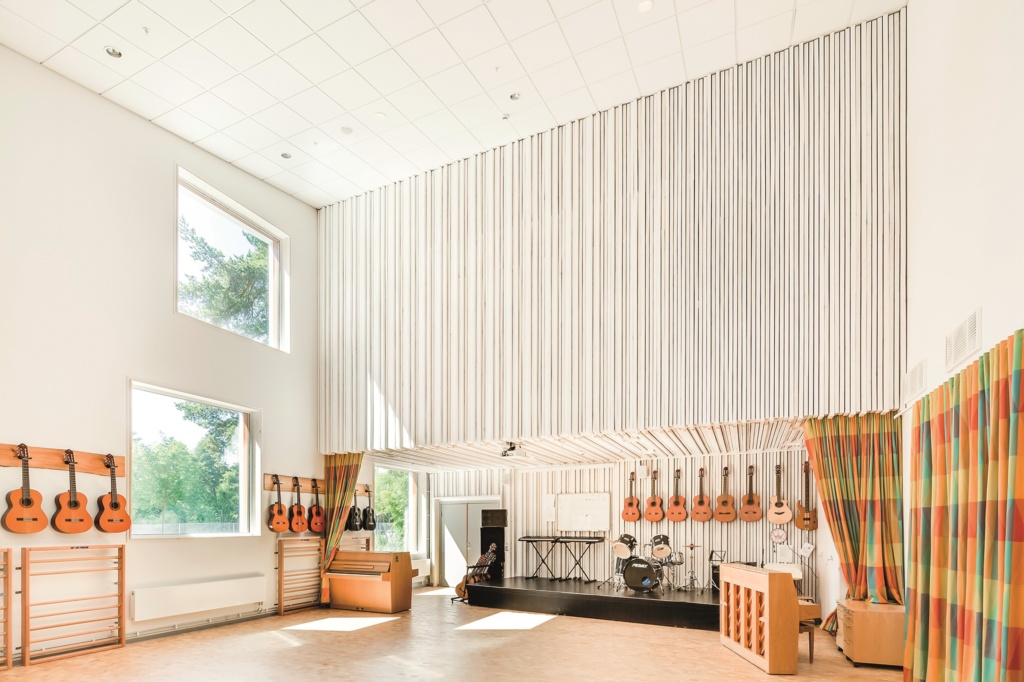
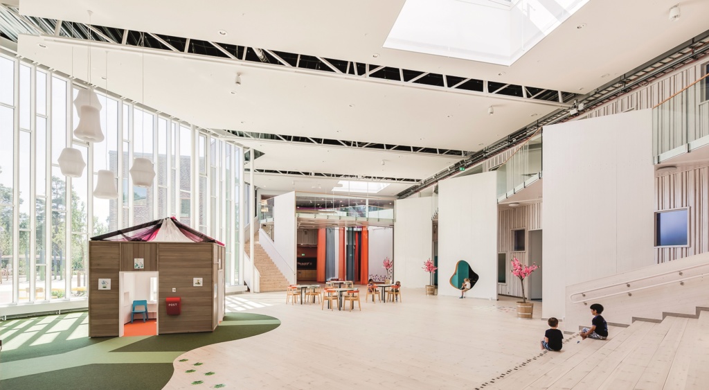
On an archipelago, 20 kilometres north of Stockholm and surrounded by trees, Brinkskolan already benefits from a preferential location, and the designers have certainly taken full advantage of that with large windows and skylights that bring the outside in and maximise natural light. Natural light has long been established in promoting wellbeing and alertness both of which are highly correlated with positive learning outcomes. The availability of natural light throughout the interior of the school is essential to its success in a location where average daytime highs are sub-zero for a quarter of the year and daylight hours are as low as 6 hours per day in the winter months. Those big windows do more than let light in of course, they provide visual access to the wooded environment outside. Natural environments have been shown to decrease stress and improve learning, so if a student IS going to gaze out of the window during class, there’s a strong case for giving them something natural to look at.
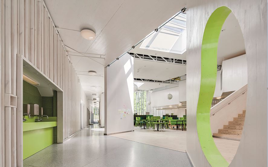
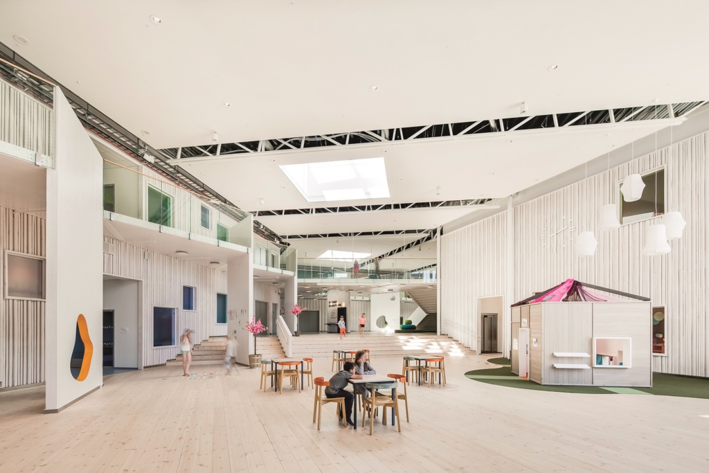
Of course, not every school has the opportunity to provided wooded views from each window, and it’s the interior design of Brinkskolan where things get really interesting. Throughout the school, white is used to provide a uniform look and feel that is both modern and clean. But white can be a very institutional and sterile colour, and so extensive use is made of bold colour accents which highlight the many customised zones for personal reflection, joint briefings, collaborative and creative work. This use of colour serves several functions:
- Green is used throughout the ground floor to link the inside to the outside providing continuity and, together with the use of natural woods, continues to provide those naturalistic cues that are beneficial to learning.
- The brightly coloured zones draw attention to the areas where learning, collaboration and play actually happen, rather than the corridors and paths that link them. This in turn reinforces the function of these zones as the attention of passing students is involuntarily drawn to them by the salient colours ensuring that see how they’re being used by their peers
- The colours clearly delineate the zones without the need for walls or other dividers in many cases leaving the spaces open and students feeling safe at all times.

Perhaps most importantly, the colour provides an element of fun to the environment, reducing the austerity of the plain white walls and encouraging the students to explore and engage with the spaces.
The minimal use of walls to delineate zones associated with different types of interaction brings with it another benefit, which is the freedom for the students to move items around and influence their own space. Research in office spaces has shown that this can be hugely influential in increasing emotional wellbeing and productivity, and this is not just a factor of having a nice space to work in, it’s directly a consequence of the users’ ability to contribute to the selection and arrangement of elements in that space. The classrooms themselves are not structured around regimental rows of desks and can be easily adapted to form configurations that facilitate group work as well as independent study. The uncluttered environments provide good lines of sight for both teacher and pupils alike which is important for maintaining attention, since we naturally orientate towards a speaker to enable us to use facial cues to aid comprehension. The flexibility of the seating enables the students to become the focal point of attention in the classroom just as easily as it does the teacher.
